Home

My fourth and final brief for Photography was to create a series of 6 images that represent the idea of Home. I struggled with this piece at first as the idea was much too broad meaning I often went off topic. Referring to Adam O’Meara and peers for guidance, I found out fellow classmate and friend, Harry Beaumont, was creating his set of work around the saying ‘Home is Where You Lay Your Hat’ which inspired me to find my own saying or cliché to work around. Eventually I stumbled across this image which really tipped the scale for what I wanted my idea to be:

home_is_where_the_wifi_connects_automatically_photo_print-r8472142a068a42c9b943af4cab2c22ca_a0ib_8byvr_324

The image humoured me but also got me thinking, no matter where you are or what situation you’re in, everyone is connected by the internet. I personally strongly keep in contact with my family via various Social Media platforms like Whatsapp or Facebook so the idea really struck me inspiring me to come up with a piece involving various people holding their laptops with a picture of their family on the screen. I specifically asked them to show a picture that held a lot of sentimental meaning to them to really get the feeling of Home and how you’ll always be connected as a family no matter where you are. These are my images:

Danny Heather Molly Shea Sophie Zack

The thought behind this particular set of images was to completely remove the colour from everything except the image on the screen as I felt I wanted to portray a sense of isolation in the subjects showing they are away from their families, yet remain a bright and colourful feel to the image on the screen when they remember their families back home thus the family image is bright and happy. I also asked the subjects to ‘stand as though their family was around them’ to attempt to get a comfortable and natural look to further embrace that sort of family portrait style of image and create a comforting feel to my images. This went two ways, either the subject would force a smile or in certain cases not smile at all which I found to be very interesting and say a lot about their family values and how comfortable they are expressing themselves.

Screen Shot 2015-12-04 at 01.57.36

Screen Shot 2015-12-04 at 01.57.23

A large inspiration for me came from an incredible set of images called ‘Being Together’ created by photographer John Clang. In this set of images, John would project images of his family from over Skype calls onto walls and stand in them to create the feeling as though he was there with them. I wanted to use this sense of participating in a family portrait without actually being there without completely replicating the idea thus using the image on a laptop rather than a projection on the wall.

Portraiture

My third brief (Uploaded in the right order this time) was the Portraiture brief. My inspiration for this piece was to find people who looked like the various races from Middle Earth, home of the many characters from Lord of the Rings and the Hobbit. I had to put thought into the stance, backgrounds and lighting of my subjects to reflect the intended race I wanted to portray. Here are the images I produced:

Elf

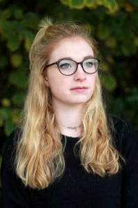
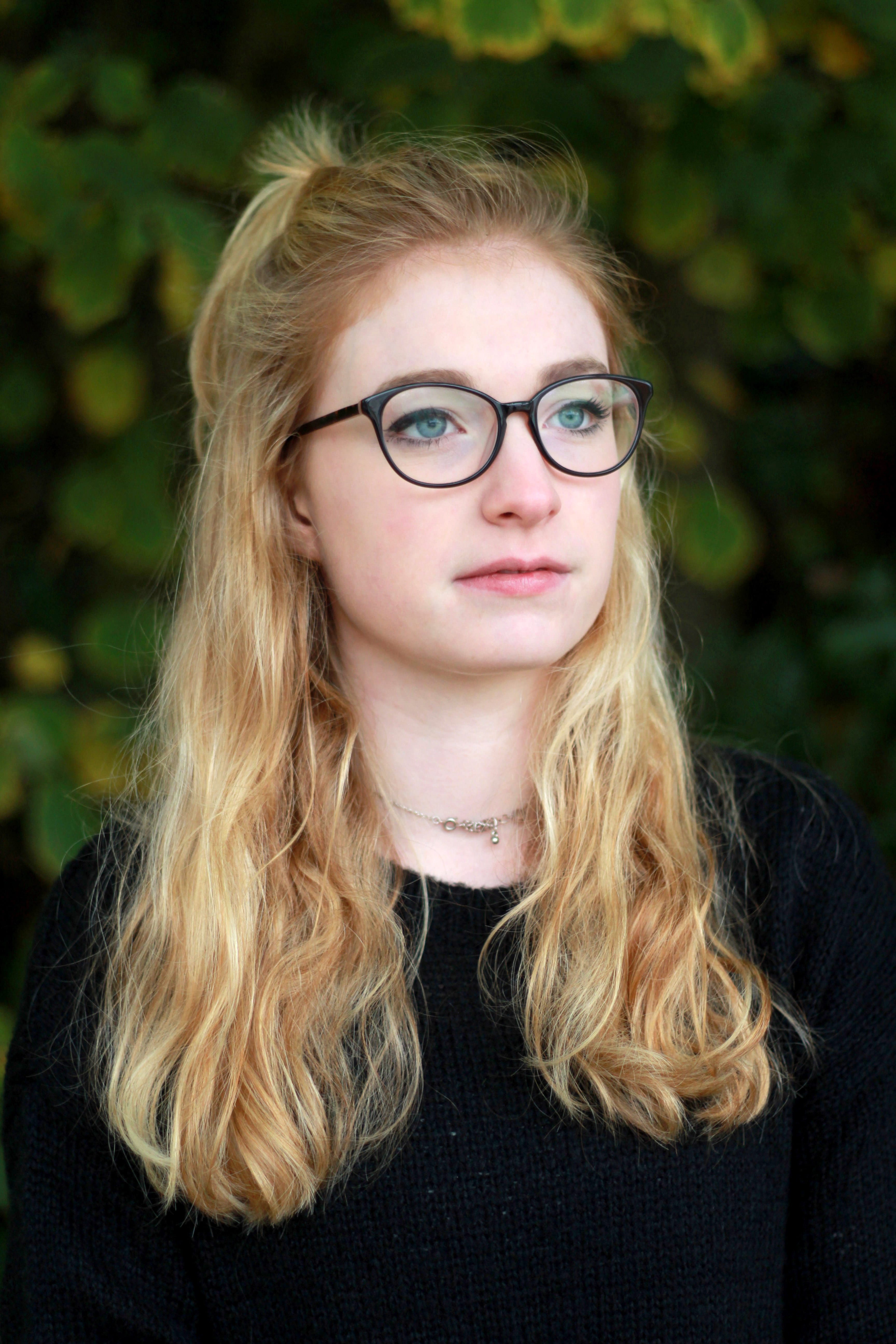
This portrait of my good friend Ali portrays the race of Elves. Ali is as close to an Elf as I would have ever been able to find, the long blonde hair and even the way she had it tied at the time were identical to the film portrayal. I chose to make the lighting very even over the whole of her face as Elves are known for their elegance and this use of lighting created a really smooth and bright look on the skin. As well as this I really wanted the colours in the image to be bright and vibrant so I positioned her in front of a very green leafy background which also encapsulates the Elves homeland being majorly in the Forrest. I asked the subject to raise her head slightly up and look past the camera as this gave a really regal look to the subject portraying the higher class and almost royal attitude of the Elves in Middle Earth.

Dwarf

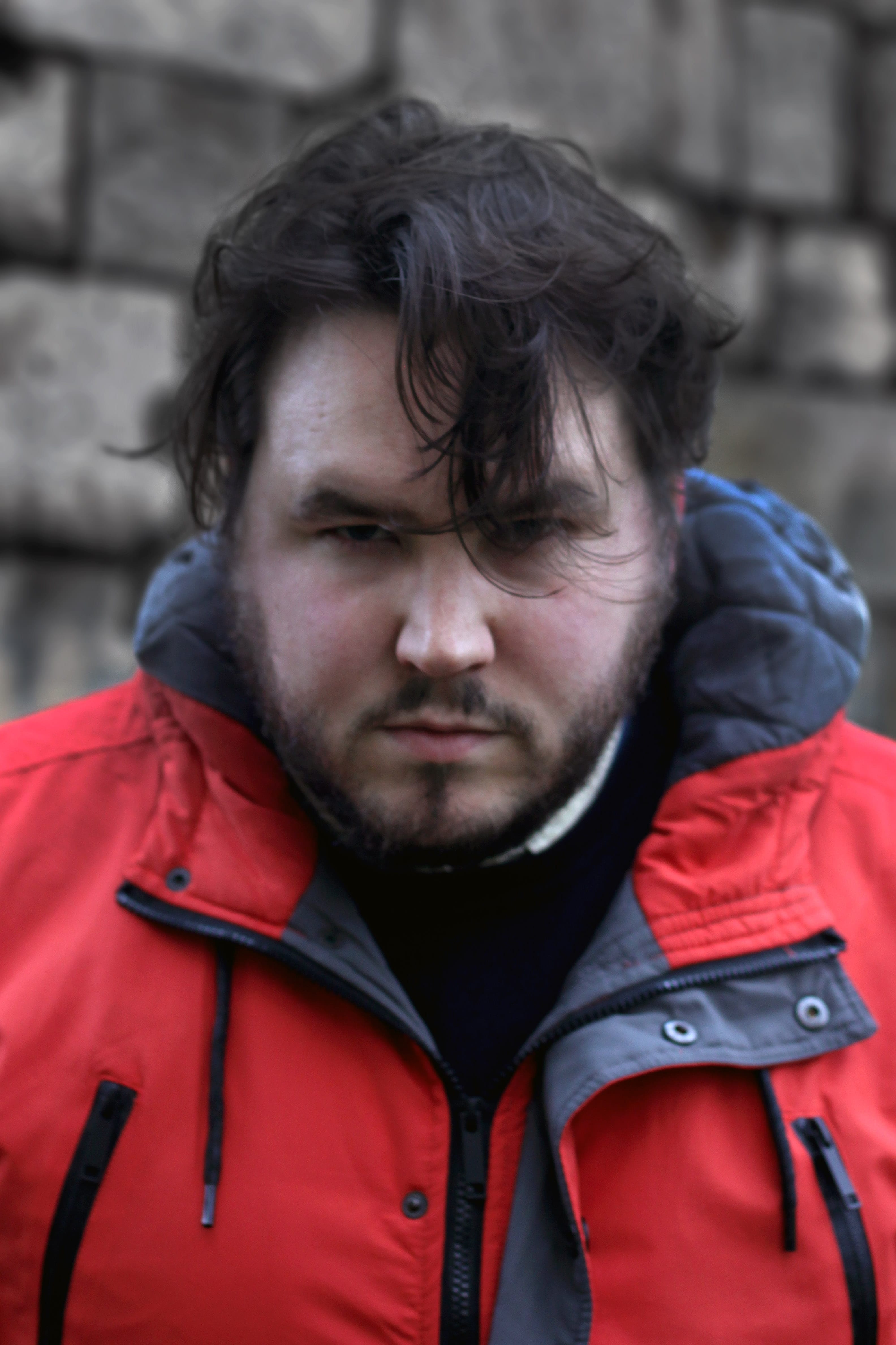
This portrait is of the great Jack Shelbourn representing the race of Dwarves. Dwarves are typically rough and stocky characters with rather incredible looking beards so I had to find a subject to match the description, i.e. a bearded man with large shoulders. The background in this image are the large stone brick supports of the cathedral. The dull grey tones and the texture are significantly similar to that of a Dwarven Stronghold so it fits the character well. As the Dwarves are often short and stocky I asked the subject to almost bury his head into his shoulders to give a much broader look to him and positioned him in a way that the lighting created some harsh shadows on his face especially the brow to really give a stronger, more rugged look. I attempted to make a slightly desaturated look on the subjects face too to really give that more dark and grubby tone as they are often depicted this way from working in the mines.

Man

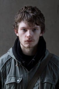
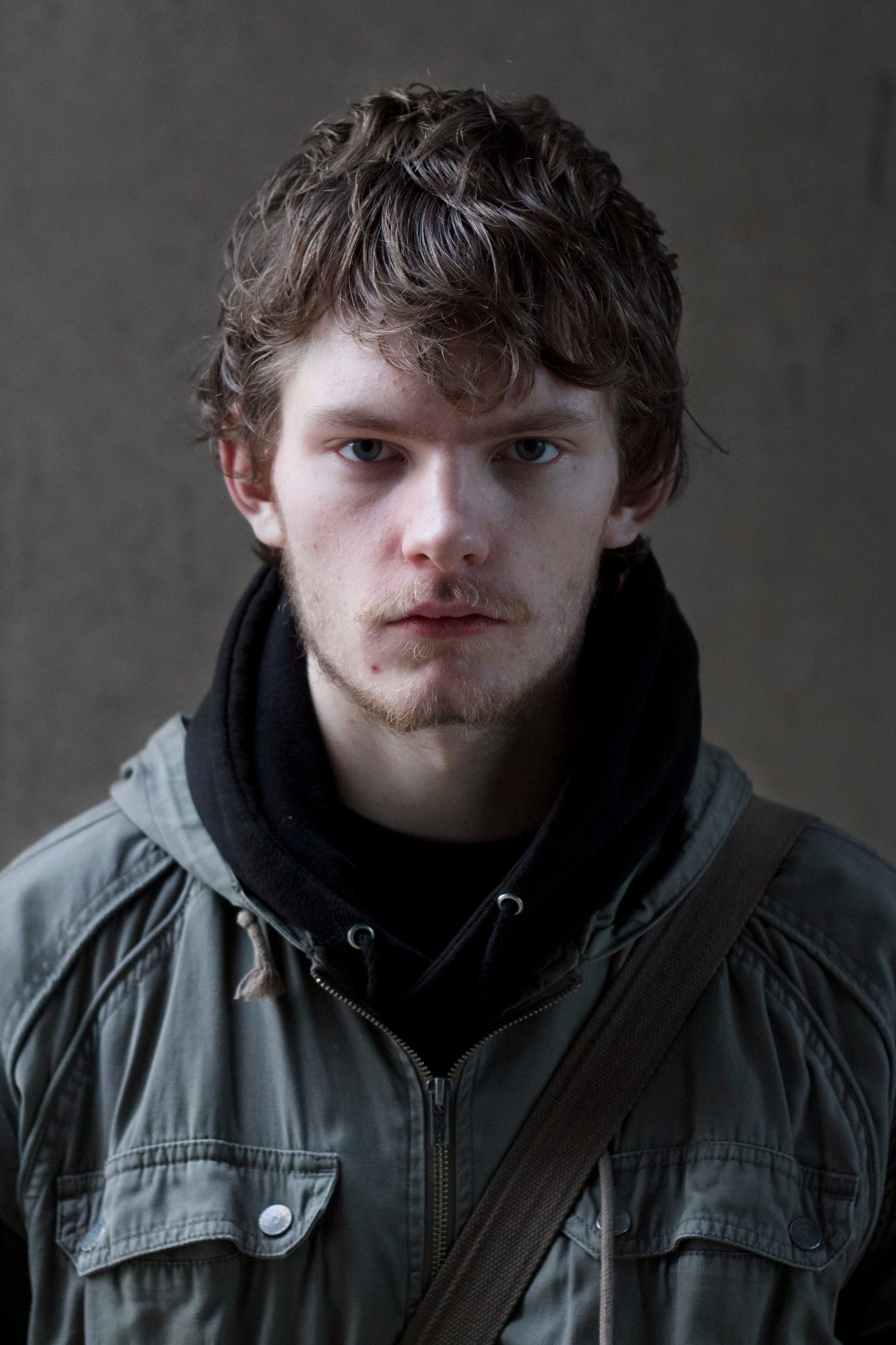
 Another friend of mine, Daniel Fessey, portrayed the race of Man. This was a little more difficult for me to capture as Men have no real defining qualities other than being the sort of warriors of Middle Earth, so I worked with this idea taking inspiration from photography of the character Aragorn from the movies. I looked for a subject that had a small amount of facial hair, not enough to be as bearded as the dwarf but enough to still give a rough unclean look. As well as this I looked for someone with a strong brow to really show the courageous and confident look depicted in the photoshoots of Aragorn. As he is the race of man I wanted the lighting to represent a generic style of male photography where one side of the face is lit while the other remains in the shade and asked the subject to look slightly through his brow, not as much as the Dwarf but still enough to give that mean, tough look. I feel this worked well as it created a nice rugged and rough look. Again I tried to get a very greyish, desaturated tone from this image as the race of Man are often one in wars and hardships, not so much a happy lifestyle.

Hobbit

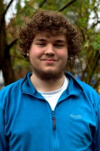
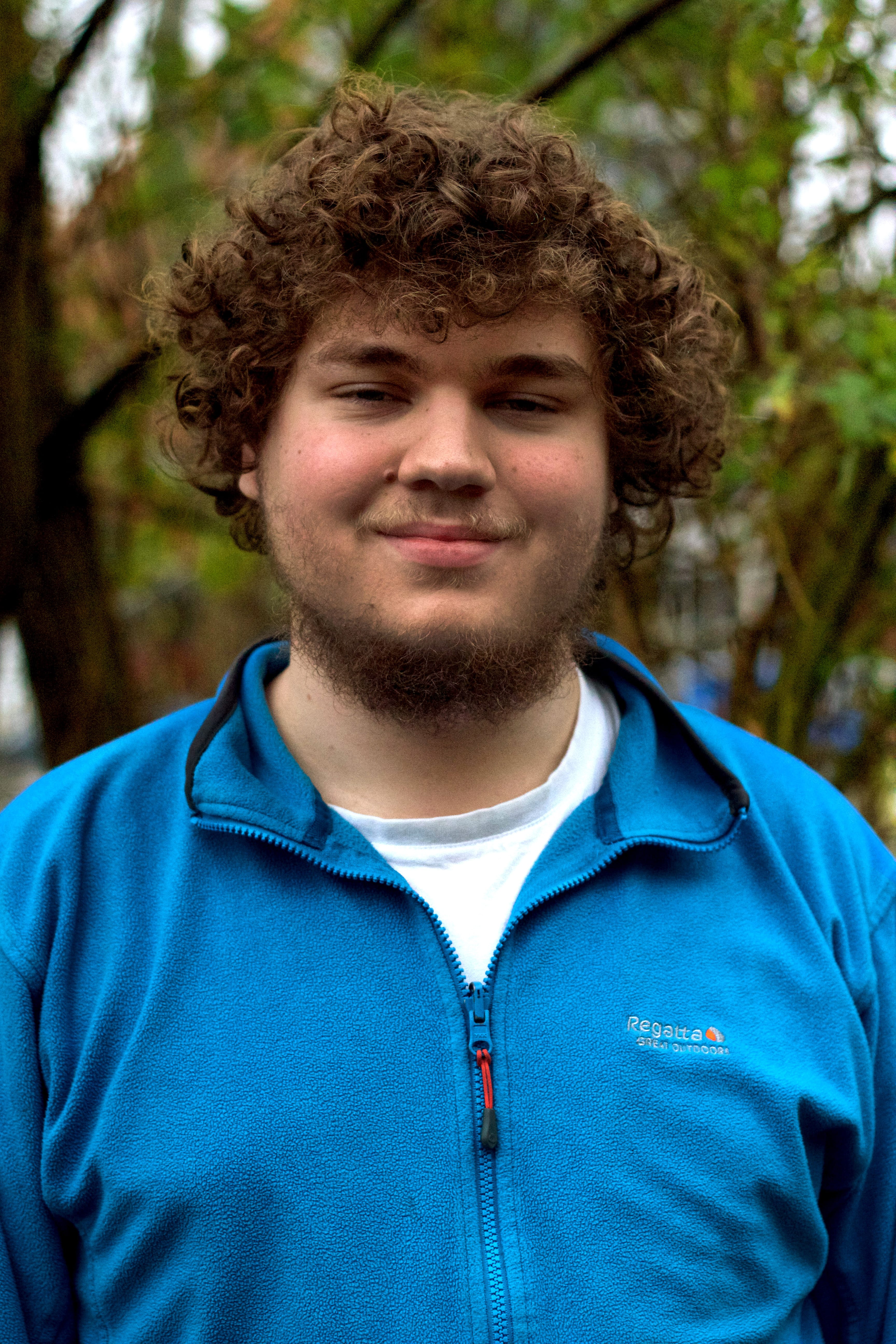
Finally, we have the image representing the race of Hobbits. Hobbits are a carefree race that generally keep out of trouble and live a jolly lifestyle so I found a jolly looking subject to fit. As well as this they are defined by having rather long curly hair in the Cinematic Universe of Middle Earth. Finding a subject to fit the description was a little tricky but eventually I came across someone who fit the bill almost perfectly. The background of this image is of a bush that I used to try and replicate the bushy, countryside of The Shire where the Hobbits live. Much like Elves, Hobbits are quite fair skinned as they generally appear somewhat youthful at old age so much like my Elf picture, I made sure the lighting spread across the face to reduce shadows. I didn’t want the whole of the subject to be illuminated as there is still a dirty look to the Hobbits as they have a very farm-like lifestyle and the slight shadows helped to give a smooth youthful look while maintaining a slight grime to it. This is the only subject I  asked to smile as the Hobbits are very happy and jolly as stated and the photos where the subject wasn’t smiling looked so out of character and to me didn’t encapsulate the Hobbits at all, thus I settled on a small but powerful smirk. I made sure this image had a slightly warmer glow to it rather than the bright colours of the Elf or the greys of the Dwarf and Man as Hobbits are very homely and like to live in comfort and I felt a warmer colour scheme would give off this cosier vibe a little better.

 lol

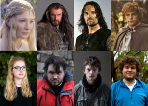
The major and obvious inspiration for how I pictured these portraits was the Cinematographic style of Peter Jackson, the Director of the films, and Andrew Lesnie, the Cinematographer. As the Cinematic Universe’ depiction of the characters was by far the best portrayal, I worked closely with how these characters looked in that particular platform as well as drawing inspiration from the promotional photography artwork also by Andrew Lesnie. I created a side-by-side image of my own portraits compared to the ones used in and for the various films by Andrew Lesnie and to show how similar the constructs are. As can probably be shown, the photos used for the comparison were the particular ones I took inspiration from the most in my own shoot and tried to recreate the feel from them. I feel I captured them rather well and overall am happy with the images I have created.

Appropriation Project.

My first brief (despite being posted second) was based around Appropriation Art. This involved taking already existing photos and altering them slightly to change their meaning. Here is the work I produced:

John Lennon


The first image is of former Beatles star, John Lennon, as a homeless man. The original image was a rugged, old looking man sitting with his dog. I Photoshopped John Lennon’s face onto the mans body as well as the sign to portray a message of how the music industry has changed.
The intended meaning was to portray how the industry and style of popular music has shifted over the years. I feel with this change of popular music style, The Beatles wouldn’t be as popular as they were thus John Lennon would never have made it big.

Kanye 2

My second image is a religious piece of the popular musician, Kanye West. I Photoshopped Kanye’s face over an image of Jesus Christ surrounded by followers, dulling them out and making the figure of Jesus much brighter as well as adding a ‘False God’ tape over the top.
The intended meaning behind this image was how fame and popularity has gone to the artists head causing him to feel he is higher than everyone else to the point he released a song titled ‘I Am a God’. As for dulling out the followers I wanted to show Kanye has little respect for his fans only caring about himself as he has shown on various occasions including walking off stage at live performances which cost audiences a lot of money to get into in the first place.

Donald Trump


My third image is of American Millionaire, Donald Trump, in clown makeup. It is apparent he is crying in the image due to the faded and running makeup marks down his face as well as the text reading “Life’s a circus… And I’m the clown’ accompanied by his very own signature.
It’s a running joke on Social Media that Donald Trump is running for President in 2016, and rightfully so as he’s an idiot! It’s beginning to become apparent that he is realising this to be fact but still campaigns as though he has a fighting chance, thus I created him a crying clown, a humorous look with a crushed soul. The text further contributes to this idea, to make it more believable I found a font that closely matched that of his signature. The text written in a signature way also makes it appear as though he knows he’s a laughing stock and writes it down signing it with his official stamp.

My Workshop Tutor, Adam O’Meara criticised certain pieces of work for not being controversial enough. We were only supposed to create three images however I challenged his claims and created a fourth:

9-11

Imitating those infamous 9/11 conspiracy images claiming it was an “Inside Job”, I came up with my own take on it editing Burger King logos onto the towers and a McDonalds Missile blasting into it with text reading ‘The Real Inside Job’.
Fast Food these days is an increasingly big concern in terms of health and their mascots are more recognisable than World Leaders and Cultural icons. I felt it would be considered “big news” for one of these huge corporations to sabotage another thus 9/11, a major event, would suffice to show this impact. The text, ‘The Real Inside Job’ refers to the fact that many people overlook acts of Terrorism in the media for smaller petty issues like the Kardashians or celebrity news and probably would freak out over an even pettier issue like McDonalds fighting with Burger King.

Still Life Project – Tryptic

The second project for my Media Production Photography course (Despite being posted first) was to create a Still Life Triptych. Here is the work I produced:

Still Life Tryptic - Andy Chapman

The first image of the cans took many attempts until I was happy. Positioning of the cans proved to be an issue as I had to put several poses into practice before finding one that worked well. I also found the lighting a little tricky as the can lying down was often left in shadow making the image look very dark. To overcome this, I angled a mirror over the can to reflect the light source onto it reducing the shadows. One thing I like about this photo is how both cans are battered and dinted however one stands almost like the victor of a fight giving a sense of righteousness and authority

My second image of a battered Lynx can I found much easier to photograph. I angled it in a way that showed the most damage as it reflected nice with the light and showed off a lot of contrast in the shadows. The scuffs and dints on the metal caused many shadows that I feel give a great texture to the can. I particularly like how the plastic part almost appears to be looking up looking rather regal despite being battered giving, again, a righteous stance despite its hardships.

The final picture of the plastic container was interesting to take as originally it lacked any form of interest at all as the light simply went right through it. To counter this, I scrunched up some golden foil from biscuits I had been eating and placed them inside the container as something for the light to reflect. I had to use the mirror as a reflector again in this image to bounce the light onto the foil to really get the bright effect I wanted from them and really make them glow.

The background for this piece was very simple. I took a dark purple towel and draped it over my guitar amp to create a backdrop and lit it using the LED bedside lamp build into the wall in my accommodation. I blacked out the room and occasionally experimented with covering the light source slightly to create a darker tone giving my photos a different effect. I’m rather pleased with how this turned out considering it was my first go at a makeshift studio.

24 blue-gun

A large inspiration for this project was the work of Denis Dorran in his project “Salvaged”. The battered objects on an incredibly dark background with the bright lighting really appealed to me visually and I instantly knew it was a style I wished to imitate. I first saw this style in the Lecture on Still Life Photography and made a clear note to remember this particular work as it really resinated with me.