My first brief (despite being posted second) was based around Appropriation Art. This involved taking already existing photos and altering them slightly to change their meaning. Here is the work I produced:

The first image is of former Beatles star, John Lennon, as a homeless man. The original image was a rugged, old looking man sitting with his dog. I Photoshopped John Lennon’s face onto the mans body as well as the sign to portray a message of how the music industry has changed.
The intended meaning was to portray how the industry and style of popular music has shifted over the years. I feel with this change of popular music style, The Beatles wouldn’t be as popular as they were thus John Lennon would never have made it big.
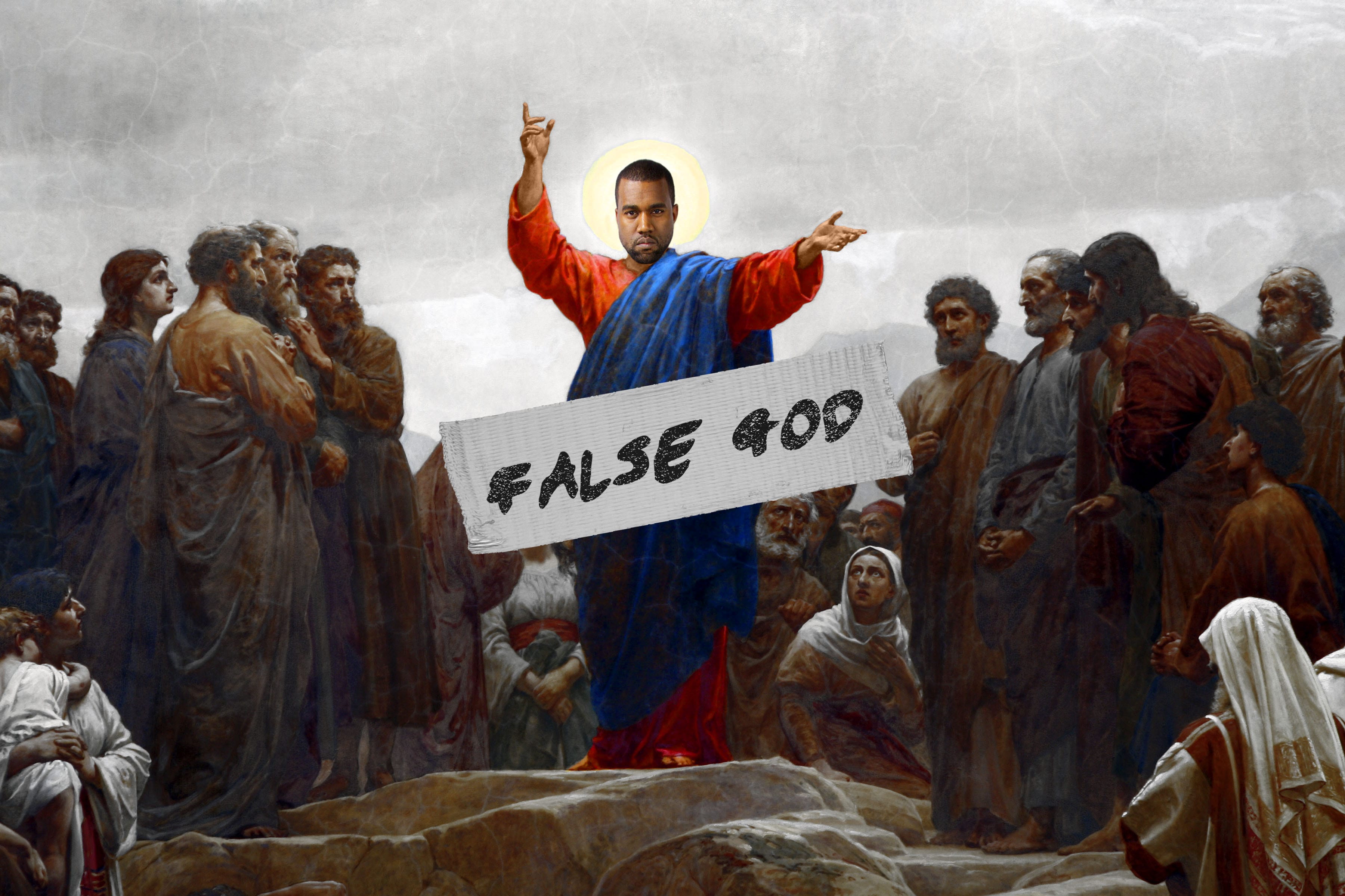
My second image is a religious piece of the popular musician, Kanye West. I Photoshopped Kanye’s face over an image of Jesus Christ surrounded by followers, dulling them out and making the figure of Jesus much brighter as well as adding a ‘False God’ tape over the top.
The intended meaning behind this image was how fame and popularity has gone to the artists head causing him to feel he is higher than everyone else to the point he released a song titled ‘I Am a God’. As for dulling out the followers I wanted to show Kanye has little respect for his fans only caring about himself as he has shown on various occasions including walking off stage at live performances which cost audiences a lot of money to get into in the first place.

My third image is of American Millionaire, Donald Trump, in clown makeup. It is apparent he is crying in the image due to the faded and running makeup marks down his face as well as the text reading “Life’s a circus… And I’m the clown’ accompanied by his very own signature.
It’s a running joke on Social Media that Donald Trump is running for President in 2016, and rightfully so as he’s an idiot! It’s beginning to become apparent that he is realising this to be fact but still campaigns as though he has a fighting chance, thus I created him a crying clown, a humorous look with a crushed soul. The text further contributes to this idea, to make it more believable I found a font that closely matched that of his signature. The text written in a signature way also makes it appear as though he knows he’s a laughing stock and writes it down signing it with his official stamp.
My Workshop Tutor, Adam O’Meara criticised certain pieces of work for not being controversial enough. We were only supposed to create three images however I challenged his claims and created a fourth:
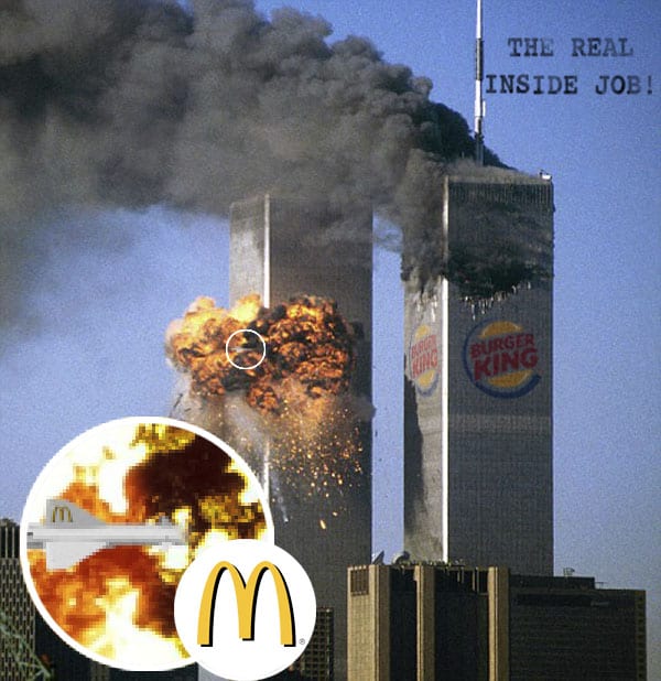
Imitating those infamous 9/11 conspiracy images claiming it was an “Inside Job”, I came up with my own take on it editing Burger King logos onto the towers and a McDonalds Missile blasting into it with text reading ‘The Real Inside Job’.
Fast Food these days is an increasingly big concern in terms of health and their mascots are more recognisable than World Leaders and Cultural icons. I felt it would be considered “big news” for one of these huge corporations to sabotage another thus 9/11, a major event, would suffice to show this impact. The text, ‘The Real Inside Job’ refers to the fact that many people overlook acts of Terrorism in the media for smaller petty issues like the Kardashians or celebrity news and probably would freak out over an even pettier issue like McDonalds fighting with Burger King.