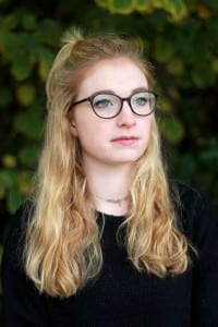
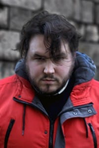
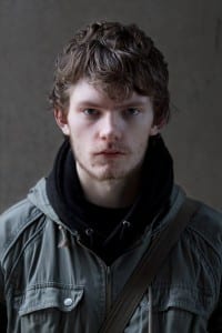
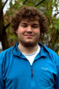
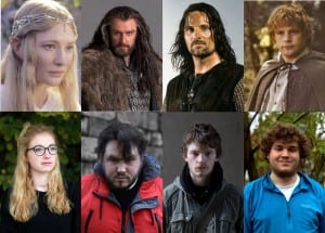
My third brief (Uploaded in the right order this time) was the Portraiture brief. My inspiration for this piece was to find people who looked like the various races from Middle Earth, home of the many characters from Lord of the Rings and the Hobbit. I had to put thought into the stance, backgrounds and lighting of my subjects to reflect the intended race I wanted to portray. Here are the images I produced:
This portrait of my good friend Ali portrays the race of Elves. Ali is as close to an Elf as I would have ever been able to find, the long blonde hair and even the way she had it tied at the time were identical to the film portrayal. I chose to make the lighting very even over the whole of her face as Elves are known for their elegance and this use of lighting created a really smooth and bright look on the skin. As well as this I really wanted the colours in the image to be bright and vibrant so I positioned her in front of a very green leafy background which also encapsulates the Elves homeland being majorly in the Forrest. I asked the subject to raise her head slightly up and look past the camera as this gave a really regal look to the subject portraying the higher class and almost royal attitude of the Elves in Middle Earth.
This portrait is of the great Jack Shelbourn representing the race of Dwarves. Dwarves are typically rough and stocky characters with rather incredible looking beards so I had to find a subject to match the description, i.e. a bearded man with large shoulders. The background in this image are the large stone brick supports of the cathedral. The dull grey tones and the texture are significantly similar to that of a Dwarven Stronghold so it fits the character well. As the Dwarves are often short and stocky I asked the subject to almost bury his head into his shoulders to give a much broader look to him and positioned him in a way that the lighting created some harsh shadows on his face especially the brow to really give a stronger, more rugged look. I attempted to make a slightly desaturated look on the subjects face too to really give that more dark and grubby tone as they are often depicted this way from working in the mines.
Another friend of mine, Daniel Fessey, portrayed the race of Man. This was a little more difficult for me to capture as Men have no real defining qualities other than being the sort of warriors of Middle Earth, so I worked with this idea taking inspiration from photography of the character Aragorn from the movies. I looked for a subject that had a small amount of facial hair, not enough to be as bearded as the dwarf but enough to still give a rough unclean look. As well as this I looked for someone with a strong brow to really show the courageous and confident look depicted in the photoshoots of Aragorn. As he is the race of man I wanted the lighting to represent a generic style of male photography where one side of the face is lit while the other remains in the shade and asked the subject to look slightly through his brow, not as much as the Dwarf but still enough to give that mean, tough look. I feel this worked well as it created a nice rugged and rough look. Again I tried to get a very greyish, desaturated tone from this image as the race of Man are often one in wars and hardships, not so much a happy lifestyle.
Finally, we have the image representing the race of Hobbits. Hobbits are a carefree race that generally keep out of trouble and live a jolly lifestyle so I found a jolly looking subject to fit. As well as this they are defined by having rather long curly hair in the Cinematic Universe of Middle Earth. Finding a subject to fit the description was a little tricky but eventually I came across someone who fit the bill almost perfectly. The background of this image is of a bush that I used to try and replicate the bushy, countryside of The Shire where the Hobbits live. Much like Elves, Hobbits are quite fair skinned as they generally appear somewhat youthful at old age so much like my Elf picture, I made sure the lighting spread across the face to reduce shadows. I didn’t want the whole of the subject to be illuminated as there is still a dirty look to the Hobbits as they have a very farm-like lifestyle and the slight shadows helped to give a smooth youthful look while maintaining a slight grime to it. This is the only subject I asked to smile as the Hobbits are very happy and jolly as stated and the photos where the subject wasn’t smiling looked so out of character and to me didn’t encapsulate the Hobbits at all, thus I settled on a small but powerful smirk. I made sure this image had a slightly warmer glow to it rather than the bright colours of the Elf or the greys of the Dwarf and Man as Hobbits are very homely and like to live in comfort and I felt a warmer colour scheme would give off this cosier vibe a little better.
The major and obvious inspiration for how I pictured these portraits was the Cinematographic style of Peter Jackson, the Director of the films, and Andrew Lesnie, the Cinematographer. As the Cinematic Universe’ depiction of the characters was by far the best portrayal, I worked closely with how these characters looked in that particular platform as well as drawing inspiration from the promotional photography artwork also by Andrew Lesnie. I created a side-by-side image of my own portraits compared to the ones used in and for the various films by Andrew Lesnie and to show how similar the constructs are. As can probably be shown, the photos used for the comparison were the particular ones I took inspiration from the most in my own shoot and tried to recreate the feel from them. I feel I captured them rather well and overall am happy with the images I have created.

